Take Two Wallgreens Every Six Hours
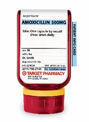
Just saw this research from a few weeks back that claims the biggest thing on prescription bottles is the store’s logo, not any useful piece of information. Makes sense, I suppose - they’re the ones selling it. But it reminded me of one of my favorite design stories of the past couple years, the innovative prescription bottle created by Target (shown above).
What’s so innovative about it? ” The designer thought great improvements could be made by reformatting label layout with clarity and a logical sequence of information as primary criteria,” according to a packing industry publication. Crazy, that - a label designed so that the patient can understand the information, rather than use it as a billboard. Crazy Minnesotans…
Published by: tgoetz on October 2nd, 2007 | Filed under Misc., pharma
One Response to “Take Two Wallgreens Every Six Hours”
Leave a Comment
-
Must Reads
Recent Posts
- Genetic Medicine: How Does it Play In South Dakota?
- The Fish Dilemma: Omega 3 or Mercury?
- On Health Records, I’ll Take Microsoft Over Aetna
- Beating Cancer Without Drugs
- Personalized Medicine That Doesn’t Work
- Take Two Wallgreens Every Six Hours
- USC 1, Staph Infections 0
- Is Pharmacogenomics For Real?
- What Causes Heart Disease? No One Knows
- The Power of Negative Thinking: Freeing the Dark Data of Science
Categories
- cancer
- CDC
- CDC’s MMWR
- china
- databases
- Disease
- DNA
- Epidemiology
- Genetics
- Genome
- Health Care Industry
- history
- Infection
- Law
- Media
- mental health
- Minnesota
- Misc.
- nutrition
- obesity
- Pathogens
- pharma
- Policy
- Technology
- trade
- Trends
- Uncategorized
-
Blogroll
-
Meta
- Register
- Login
- Entries RSS
- Comments RSS
- WordPress.com
October 2007 M T W T F S S « Sep 1 2 3 4 5 6 7 8 9 10 11 12 13 14 15 16 17 18 19 20 21 22 23 24 25 26 27 28 29 30 31
Previously on Epidemix
- October 2007 (8)
- September 2007 (9)
- August 2007 (10)
- July 2007 (13)
- June 2007 (10)
- May 2007 (24)
- April 2007 (11)
- March 2007 (13)


October 3rd, 2007 at 9:35 am
Geeat idea, although convincing manufaturers to do something to help customers rather than income will be difficult., such as this or requiring pills or capsules to be the same shape color or size for any spwcific medication, etc.